WorkCase Study
Vanmoof Rider App Redesign
During 2021-2022, VanMoof was developing its new S5 and X5 e-bikes, while also investing heavily in its digital team: positioning the app and services as a future revenue stream, not just a companion to the hardware.
Role
Senior Experience Designer, part of the Rider App team: aligning business goals with user needs
- Defined the product and experience vision for the next-generation rider app across iOS and Android
- Partnered with Industrial Design on a unified bike-app interaction language (Matrix UX)
- Shaped core product decisions in close collaboration with product and engineering. Leading the design from concept to implementation, owning the end-to-end execution.
- Design system lead: defined direction, built components, and supported implementation across both platforms
Timeline
2021-2022
The team
Head of Design, Senior Experience Designer, Junior Designer
The goal
With the launch of the S5 and X5 bikes, the opportunity was to evolve the rider app to better support new interactions and enable future service offerings.
In parallel, I partnered with the Industrial Design team to shape the the interaction language of the bike's new displays- aligning the experience across app and hardware into one cohesive product offering.
The Process
01. Identifying the gaps and opportunities
Support queues and rider communities were the most useful signal. Key settings buried too deep, an app that didn't match the premium feel of the bike, competitors catching up. That defined our priorities.
02. Making a defining decision in the app
We went from four tabs to three. Assistance levels moved to the Home screen, cutting two or three layers of navigation. It also freed up space for a widget system we knew we'd need for future bike types. We tested early and brought stakeholders along with regular demos instead of big reveals. Four to three tabs wasn't the only option we considered. An earlier direction kept four tabs but reorganised the hierarchy within them. We prototyped it and tested it. It solved the depth problem but created a new one: the home screen lost its focus, and core riding controls were still competing for attention. Cutting the tab entirely was the harder call, but the cleaner one.
03. Pairing with Industrial Design
The S5 and X5 dropped the old matrix display for LED strips on the handlebar. Phone and bike had to feel like one thing, every interaction needed a shared choreography across both surfaces. Nothing off the shelf worked for prototyping this, so we built our own method.
04. Stay close through shipping
I stayed hands-on until the end: building components, testing builds with developers daily, and keeping the visual refresh coordinated across product, brand and marketing. Dark mode, new colours, illustration system.
The outcome
New App architecture
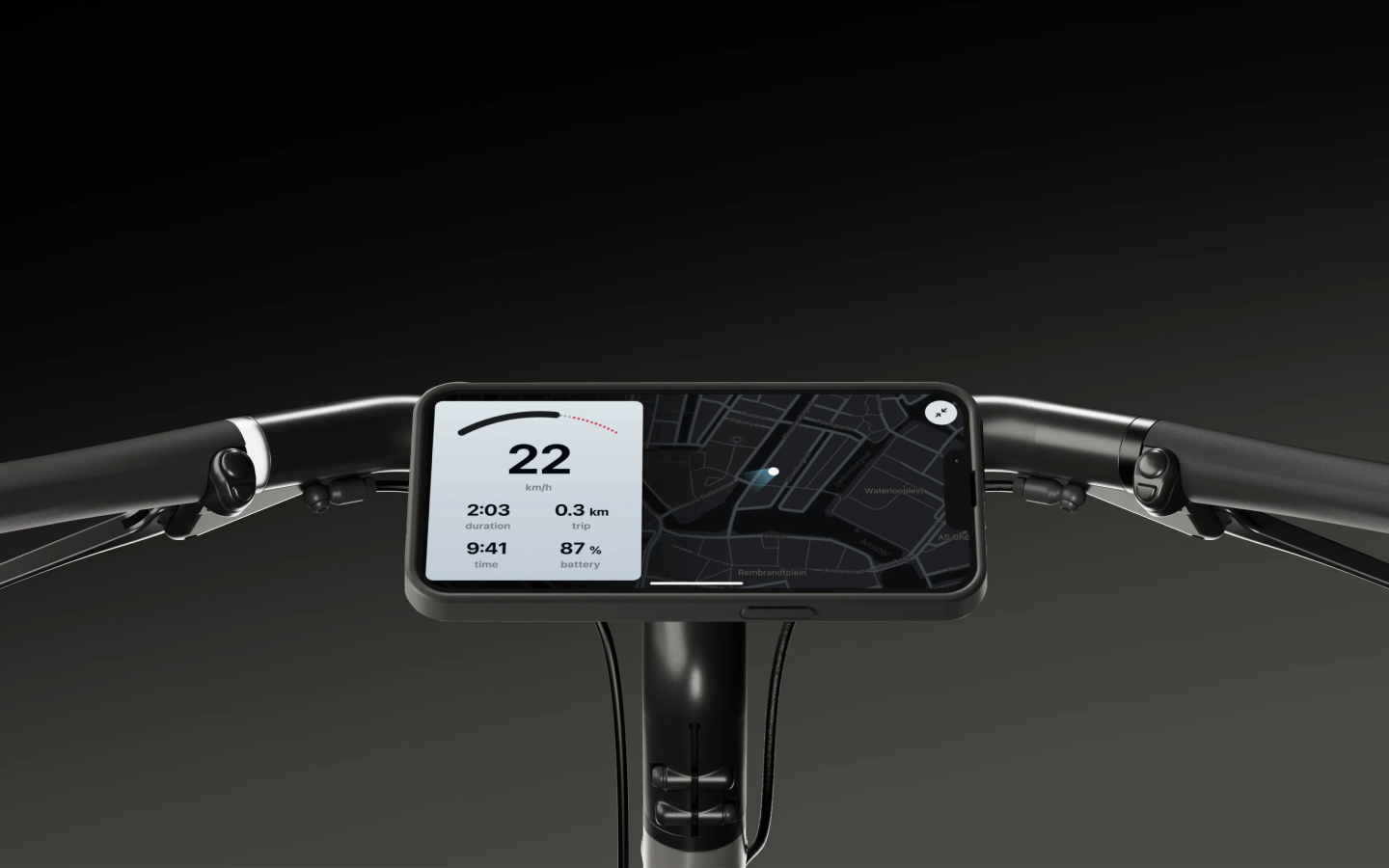
Moving from four to three tabs navigation, to simplify the app and put controls in focus. Riders had assistance level (and more) in Home- which was previously buried in layered menus. The result was a faster day to day experience for our riders, that use the app to set their bike that could scale to new bike types without another full app revamp
Widgets in Home screen
We introduced a widget system, that provided flexibility for different bike requirements and rider context that we previously lacked. Depending on the rider context and bike status, the widget would update- showing most relevant actions on top of the scroll, hiding/showing the navigation controls, 'lighting up' the UI when the bike is unlocked, etc
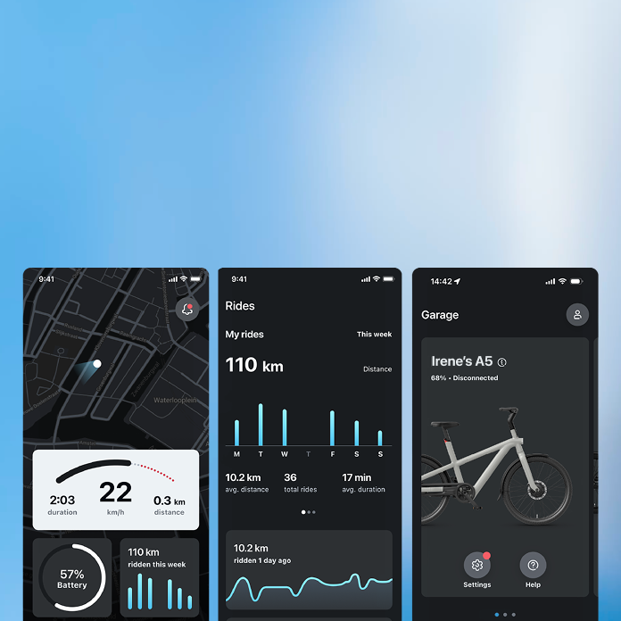
New visual language
In coordination with the S5/X5 launch and a broader brand update, the app was refreshed with a new visual language: true dark mode, new accent colour, and a new illustration system. I lead this efforts in the digital side- in collaboration with brand and marketing teams.
Matrix UX, Bike >< App Interactions
The unified interaction language across the phone display and the bike's physical handlebar lights (halo lights) was one of the most complex and rewarding parts of the project.. Working closely with Industrial Design, we created a unified interaction language in both the app's UI & animations. It used the handlebar LEDs positions, motion, and sound as feedback. Riders could keep their attention on the handle bar, that is closer to the road than our former matrix. So it kept the interaction safer, and keeping the same familiarity of our former Vanmoof bikes
Key results
Reducing navigation depth for core rider controls addressed the single most-requested improvement in the app. The widget system shipped as the architectural foundation for the S5/X5 and was carried forward into subsequent bike models. The Matrix UX interaction language, designed in close collaboration with Industrial Design, shipped with the S5/X5 as a unified experience across app and hardware. The widget system gave us the flexibility we needed for future bike types, but the connectivity state between phone and bike wasn't communicated clearly enough. Riders couldn't always tell whether the app was actively connecting or taking longer than usual due to error. We added messaging for this post-launch, but it should have been designed in from the start, the architecture was right, the state communication wasn't.
“Building VanMoof's next generation app was a key effort for the S5/X5 launch and laid the groundwork for the s6 series, self-service products, and future subscriptions. I led the vision and crafted the interaction and design language across both the app and bike matrix. Reach out if you'd like to learn more”
Continue reading — Goodnotes 6: Building the Foundation to Scale